

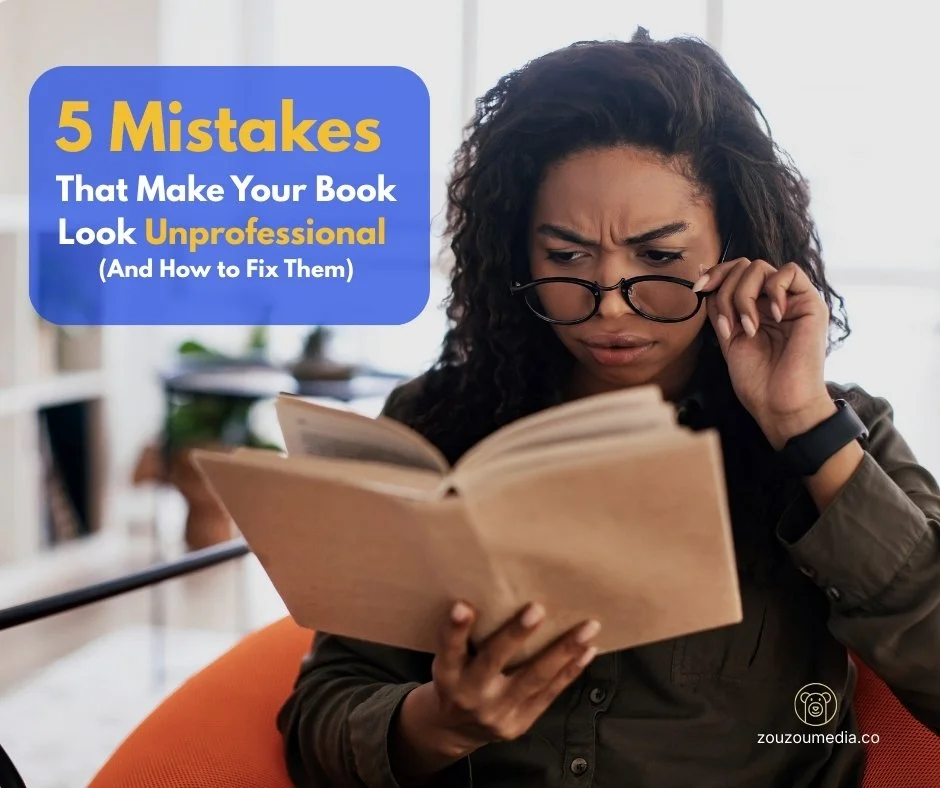
5 Mistakes That Make Your Book Look Unprofessional (And How to Fix Them)
Make it stand out.
You Can Spot a Self-Published Book in 3 Seconds—Here's Why
Let's be brutally honest. You spent eighteen months writing your book. You poured your heart onto every page, revised until your eyes crossed, and finally hit "publish" on Amazon. You're proud. You should be. But then you see it listed next to traditionally published books, and something feels... off. It doesn't quite look like it belongs on the same virtual shelf. Worse, your early readers leave reviews that include phrases like "could use more editing" or "has potential but needs polish."
Here's the uncomfortable truth that nobody wants to tell you: most self-published books look amateur within seconds of examination, not because the authors lack talent, but because they unknowingly make specific, fixable mistakes that immediately signal "unprofessional" to readers. These mistakes have nothing to do with your writing ability or storytelling prowess—they're technical and design issues that you probably didn't even know existed until it was too late.
According to research from The Book Designer, readers make quality judgments about a book within 3-5 seconds of seeing the cover, and 67% of readers report they can immediately identify self-published books based on design and production choices. More critically, 73% admit these visual cues influence whether they'll purchase, even if the description sounds interesting. You're losing readers before they ever encounter your carefully crafted prose. That's not just frustrating—it's costly.
The self-publishing revolution has democratised publishing. Over 2.3 million self-published books hit the market in 2023 alone, according to Bowker's ISBN data. Anyone with a story and determination can become a published author. But this accessibility has created an unexpected problem: readers have developed sophisticated filters for distinguishing professionally produced books from amateur efforts. They can tell. And they care.
The encouraging news? Every mistake that makes your book look unprofessional is entirely preventable. Professional-quality self-published books exist—they're indistinguishable from traditionally published ones. Once you understand the specific errors betraying amateur production, you can ensure your book meets industry standards and competes on equal footing.
The Problem: Looking Self-Published in the Worst Way
Here's the typical scenario. You finish writing, research cover designers on Fiverr or 99designs, and choose someone whose portfolio looks decent at a price fitting your budget. You format the interior yourself using Microsoft Word or a template found online. You write back cover copy, maybe getting feedback from family. You upload everything to Amazon KDP, approve the proof, and launch.
Initial sales to friends and family are encouraging. Then momentum stalls. Amazon reviews are mixed—some praise your writing, others mention the book "needs professional editing" or "looks self-published." Your ranking stays stubbornly high (remember, lower Amazon rankings indicate better sales). Bookstores decline to stock your book. Bloggers who accept self-published submissions pass on yours.
You're confused. You invested money in professional services. What went wrong? The problem is that "professional-looking" and "actually professional" aren't the same thing. Many design services targeting self-published authors deliver work that appears adequate at first glance but fails industry standards. The technical aspects of book production involve dozens of small details that collectively signal quality or its absence.
A 2022 analysis by Reedsy found that self-published books with amateur production issues sold, on average, 68% fewer copies in their first year compared to self-published books with professional production quality—even controlling for marketing budget and author platform. Poor production doesn't just make your book look bad; it directly costs you sales, reviews, and opportunities.
Mistake #1: The Cover That Screams Amateur
Your cover is your most important marketing tool. It must attract attention from your target audience, clearly signal your genre, compete visually with traditionally published books, and remain legible at thumbnail size on Amazon. Most amateur covers fail predictably.
Generic stock photos plague amateur covers—often the first image appearing in a search, making books feel forgettable. Multiple authors sometimes use identical stock photos, creating awkward situations where different books have nearly identical covers. I've seen three romance novels with the same couple embracing on a beach. Imagine the confusion.
Typography betrays amateur production faster than anything else. Font choices inappropriate for genre—playful script fonts on serious business books, or heaven forbid, Comic Sans on anything. Text poorly arranged with inconsistent spacing, misaligned elements, or too many font variations creates visual chaos. Titles difficult to read at thumbnail size doom your book—most potential readers’ first encounter your cover as a tiny image on Amazon.
Colours and visual design lack sophistication in amateur covers. Too many elements fighting for attention, no clear focal point, colours clashing or defying genre expectations, busy backgrounds obscuring titles, and dated filters or effects all announce "amateur production."
Professional covers are deceptively simple. They use negative space effectively, maintain clear visual hierarchies guiding the reader's eye, employ genre-appropriate imagery and typography, and remain impactful at small sizes. They align with current design trends in their category—thriller covers have different aesthetics than romance covers, which differ from business books.
The Fix: Study bestselling books in your specific category. Examine the top 100 on Amazon in your genre. What visual patterns emerge? What imagery types, colour palettes, and typography appear consistently? Your cover must fit within the visual language readers associate with your genre while still standing out.
Work with designers specializing in book covers specifically, not general graphic designers. Book cover design is a specialized skill with unique requirements. Request references of previous covers they've designed in your genre. Professional book cover design typically costs $500-$2,500, depending on complexity and the designer's experience. Yes, it's expensive. It's also essential.
Mistake #2: Interior Formatting That Looks Like a Word Document
Open a traditionally published book and examine it carefully. Notice the chapter headings, spacing, page numbers, and paragraph formatting. Now compare that to many self-published books. The differences are immediately apparent to regular readers.
Amateur interior formatting reveals itself through excessive spacing between paragraphs, disrupting reading flow. Professional books either indent the first line of each paragraph or add space between paragraphs, never both. Inappropriate fonts—Times New Roman or Arial throughout—are difficult to read for extended periods. Too many different fonts create visual noise.
Inconsistent formatting with irregular spacing around chapter headings, inconsistent page break placement, or margins too wide or narrow signal amateur production. Poor typography, including widows and orphans (single lines of paragraphs at page tops or bottoms), excessive hyphenation creating "rivers" of white space through text blocks, inconsistent spacing around punctuation, and failure to use proper em dashes, en dashes, and ellipses all betray unprofessional production.
Professional book interiors use carefully selected fonts designed for extended reading—Garamond, Caslon, or Minion Pro. They maintain consistent, appropriate margins, typically wider on the spine side, accounting for binding. They use proper front matter sequencing: half-title page, title page, copyright page, dedication in correct order. Chapter headings are formatted consistently with appropriate spacing. Verso pages (left-hand, even-numbered) and recto pages (right-hand, odd-numbered) align correctly—chapters traditionally start on recto pages.
The Fix: Use professional book design software or services. While theoretically possible to format in Word, professional results are difficult to achieve. Tools like Vellum (Mac users), Atticus, or Reedsy's Book Editor provide templates automatically handling most formatting standards. Alternatively, hire professional formatters specializing in book interiors, typically costing $200-$500 for standard-length books. For print books, order multiple proofs—what looks fine on screen often reveals problems in physical form.
Mistake #3: Back Cover Copy That Fails to Sell
Your back cover copy (or book description for ebooks) is sales copy, not a book report. Its job is compelling browsers to purchase, not comprehensively summarising your plot. Amateur authors consistently make predictable mistakes.
They write summaries instead of hooks, treating copy like Wikipedia entries rather than advertising. They reveal too much story or disclose major plot points that should remain mysteries. They use vague, generic language—"an unforgettable journey" or "a powerful exploration"—that could apply to thousands of books. They fail to establish stakes—why should readers care what happens? They don't include social proof like blurbs, reviews, or author credentials when available.
Professional back cover copy follows proven formulas. For fiction: establish the protagonist and their ordinary world, introduce the inciting incident or problem they face, raise stakes or complications, hint at central conflict without resolving it, and end with a question or hook creating urgency to start reading.
For nonfiction: identify the problem your book solves, explain the solution or transformation you offer, demonstrate your credibility or expertise, provide specific tangible benefits readers will gain, and include testimonials or endorsements when possible.
The Fix: Study back cover copy of bestselling books in your genre. Notice patterns in structure, tone, and approach. Pay attention to what information they include and, critically, what they omit. Consider hiring a professional copywriter specialising in back cover copy or book descriptions—relatively inexpensive at $100-$300—that can dramatically improve conversion rates. Many authors who write compellingly at book length struggle with the compression and salesmanship required for back cover copy.
Mistake #4: Skipping Professional Editing
This mistake is perhaps most damaging and most common. Many self-published authors skip professional editing entirely, relying on beta readers, friends, family, or their own proofreading. Others hire inexpensive editors from content mills providing inadequate editing masquerading as professional service.
The result? Books filled with errors traditional publishers would never allow: typos and misspellings that spellcheck misses, grammatical errors and awkward constructions, inconsistencies in character details or timeline, overwritten passages needing cutting, underdeveloped sections needing expansion, pacing problems making sections drag or feel rushed, and unclear passages confusing readers.
Readers notice immediately. Amazon reviews frequently mention editing problems in amateur books. Poor editing doesn't just affect reading experience—it damages your credibility as an author and makes readers unlikely to try your other books. According to a 2023 survey by Written Word Media, books with obvious editing issues receive 34% more negative reviews mentioning quality problems.
Professional editing occurs in stages. Developmental editing examines big-picture issues like structure, pacing, character development, and plot holes early in revision, often resulting in significant rewrites. Line editing focuses on language use, sentence structure, and flow, improving prose at the sentence and paragraph level for clarity and engagement. Copyediting addresses grammar, punctuation, spelling, consistency, and style guide adherence. Proofreading is the final check before publication, catching remaining typos or formatting errors.
The Fix: Most books need at least copyediting and proofreading, and many benefit enormously from developmental or line editing. Professional editing costs vary based on manuscript length and editing type needed, typically ranging from $1,000-$5,000 for full-length manuscripts with multiple editing passes. Yes, it's expensive. But editing isn't an area to cut corners. An unedited book is unpublishable if you want readers to take you seriously. When selecting an editor, request work samples, verify they have experience in your genre, check references from previous clients, and ensure they provide a clear scope of work and timeline.
Mistake #5: Poor Production Choices for Print Books
If you're producing print editions, numerous technical decisions affect whether your book looks professional. Amateur authors often make poor choices because they don't understand standards and options.
Choosing wrong trim sizes—unusual dimensions looking odd on shelves, or selecting sizes that inflate page counts and printing costs unnecessarily—signals amateur production. Standard trim sizes like 6×9 inches for nonfiction or 5×8 inches for fiction exist for good reasons. Non-standard sizes make books stand out badly.
Paper selection matters more than most authors realize. Cheap, thin paper showing text from the opposite page ruins the reading experience. Bright white paper creates uncomfortable glare, while cream or natural white is easier on eyes for extended reading. Paper weight affects bulk—how thick your book feels relative to page count—influencing readers' value perception.
Binding quality separates professional from amateur productions. Poor-quality perfect binding results in pages falling out after a few readings. Inadequate spine flexibility makes books difficult to hold open. Poor quality control creates crooked text blocks, misaligned covers, or other defects screaming "amateur."
The Fix: Order samples of similar books, evaluating paper quality, colour accuracy, and binding quality before finalizing specifications. Consider ordering advance review copies from multiple printers to compare quality. For serious authors planning significant print sales, working with hybrid publishers or print brokers managing offset print runs can deliver superior quality at lower per-unit costs for quantities exceeding 500-1,000 copies.
How Zou Zou Media House Transforms Amateur Books into Professional Products
This is precisely where Zou Zou Media House provides essential value. We help self-published authors navigate the complex landscape of professional book production, ensuring every element meets industry standards.
We start with an honest assessment, reviewing your current cover, interior, and back cover copy, identifying specific issues needing attention. We don't sugarcoat problems, but we recognize what's working well. Our goal is to help you understand exactly what needs improvement and why.
For covers, we connect you with vetted designers specializing in your genre with track records creating covers that sell. We help you communicate effectively with designers, provide useful feedback, and make informed decisions about cover concepts. For interior formatting, we either format your book using professional tools or connect you with experienced formatters. We ensure your print and ebook interiors meet all technical specifications and follow industry standards.
For back cover copy, we apply our understanding of sales psychology and genre conventions to craft descriptions that compel purchases. For editing, we help you find editors appropriate for your book and budget across genres with targeted recommendations, helping you understand what editing level your manuscript needs.
Beyond fixing individual elements, we help you understand how all pieces work together, creating professional packages. We look at your book holistically, ensuring cover, interior, description, and production choices align with your genre and target audience.
If you've already completed your book and want to give it the professional competitive edge, we have budget-friendly packages that make that happen. We work with authors at all investment levels, from comprehensive overhauls to targeted improvements addressing your most critical weaknesses. Many of our clients arrive after publishing their first books that didn't perform as hoped. We help them understand what went wrong and ensure their next book succeeds.
When You Get It Right
When your book looks genuinely professional, everything changes. Readers judge your book on content rather than dismissing it based on production quality. Your Amazon conversion rate improves because your book page looks compelling. Book bloggers and reviewers who take you seriously. Independent bookstores consider stocking your book. Readers who enjoy your book recommend it confidently because they're not embarrassed by its appearance.
Your confidence as an author increases dramatically. You're proud of handing someone your book or sending them to your Amazon page. You feel professional because your book looks professional. This confidence affects everything from marketing efforts to willingness to invest in your next book.
Most importantly, your book sells more copies. Professional production removes friction between potential readers and purchase decisions. Your book competes equally with traditionally published titles instead of being instantly dismissed.
Ready to transform your book from amateur to professional?
Zou Zou Media House specializes in helping authors navigate the complex technical aspects of book production. From covers and formatting to editing and back cover copy, we guide you through every decision and connect you with vetted professionals delivering quality results.
Contact us today—let's give your book the professional presentation your writing deserves. Your story is too important to let amateur production hold it back.
Website: zouzoumedia.co | Email: info@zouzoumedia.co